Graphic Design
As someone with many years of experience in professional photography, my journey naturally evolved into the realm of graphic design. This transition wasn’t just a shift in career but a fusion of skills and perspectives gained from years of working with imagery.
My background in photography provided me with a deep understanding of visual elements such as composition, colour theory, and storytelling through images. These foundational skills seamlessly transferred into the world of graphic design, where I leveraged my eye for detail, creativity, and passion for visual communication.
Through formal education at institutions like Queensland University of Technology, Southbank Institute of TAFE and Mt. Gravatt TAFE, where I completed a Bachelor of Arts, Design Communications, Certificate IV in Multimedia and the second half of Certificate in Digital Art, I honed my technical abilities in design software and expanded my knowledge of design principles.
My graphic design work extends beyond creating visually appealing designs. It involves strategic thinking, problem-solving, and effective communication to convey messages and connect with audiences. I’ve had the opportunity to work on a diverse range of projects, from educational multimedia to logo design, uniforms, advertising materials, and more.
Accessibility has been a cornerstone of my design philosophy. I understand the importance of considering diverse audiences, including those with disabilities, in design decisions. This includes thoughtful use of color, contrast, and inclusive design practices to ensure everyone can engage with and benefit from the visual content.
Overall, my experience in photography has not only shaped my approach to graphic design but also enriched my ability to create impactful and meaningful visual experiences across various mediums and platforms.
Logo Design
I crafted the logo for Imagery Captivation, strategically intertwining the initials ‘I C’ with a stylized ‘C’ resembling a camera lens. This design not only reflects my four decades of expertise in photography but also symbolizes the essence of capturing captivating imagery. The color palette, blending dark grey with a vibrant orange, creates a striking contrast that catches the eye and conveys a sense of creativity and professionalism. To ensure inclusivity and accessibility, I added a subtle gradated background that enhances the logo’s visual impact. This logo represents the fusion of my passion for photography and graphic design, embodying the storytelling and visual excellence at the core of Imagery Captivation.
At the outset, the client sought a logo reflecting the facade of their shop. While I created a design based on their request, I also envisioned an alternative concept inspired by the business name, Crossroad Books. In this design, I creatively merged the letters ‘C’ and ‘B’ to form a crossroads, symbolizing the meeting point inherent in the name. To reinforce the road theme, I added dotted lines reminiscent of road markings. Unlike the location-specific design, this logo transcends geographical boundaries, making it more universally memorable for the business’s clientele.
Uniform Design
As an enthusiastic lawn bowler, I was approached to design the RAAF Amberley Bowls Club (RABC). The club requested that the original design of the uniform to be maintained which featured a graphic of the F111 aircraft on the back. The original uniform had become unavailable after the closure of Kombat Uniforms. To fulfil their request, I meticulously recreated the F111 graphic using Adobe Illustrator, ensuring a high-quality and accurate representation of the new uniforms. I also had to recreate the sponsor’s logos which appeared on the sleeves and the RABC crest which was located on the front left side. The final result was roundly accepted to be one of the best-designed uniforms for the Cunningham District Lawn Bowls Association.
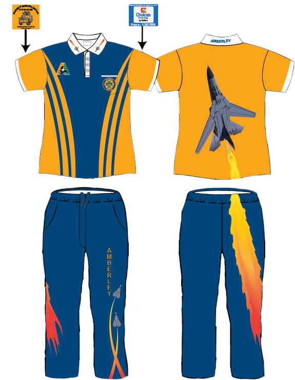


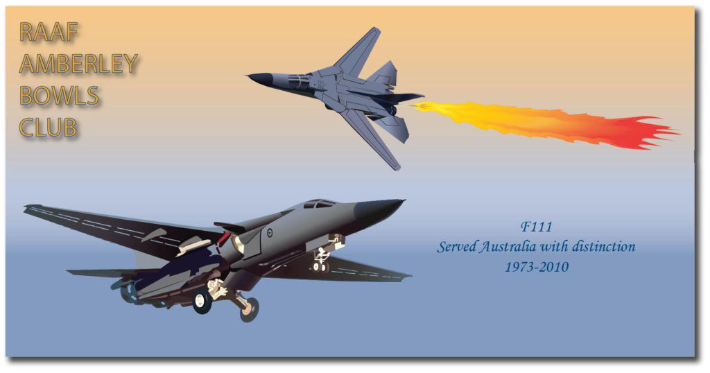
The improvements in the graphic of the F111 were so well-received that a further request was made to add it to the RABC Bowls Cloth. I agreed, but I also enhanced the design. The F111 was an iconic aircraft flown by the Royal Australian Air Force (RAAF) for nearly 40 years, and I believed it deserved a design that honoured its service. In addition to the inflight F111 conducting its legendary dump and burn, I included a landing aircraft to symbolize its retirement from service with the RAAF. This bowls cloth became a highly sought-after souvenir among members of the club and visiting bowlers alike.
Harrisville Bowls Club faced a similar challenge to RAAF Amberley Bowls Club, as their uniform design was also lost due to the closure of Kombat Clothing. I was approached to recreate their uniform design based on available photographs.
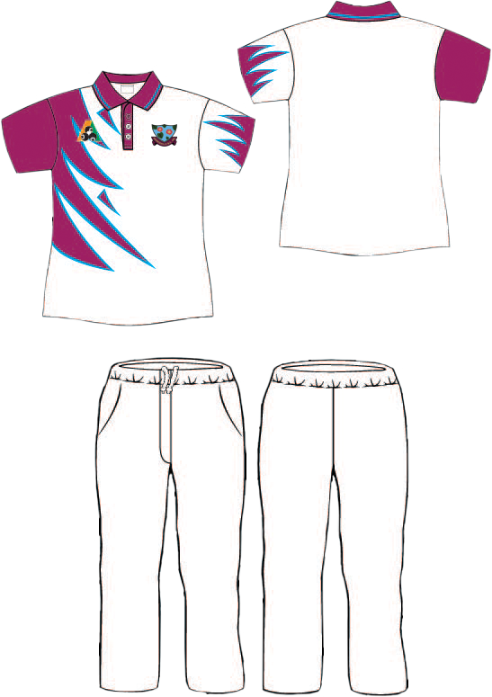
Like RAAF Amberley Bowls Club, Harrisville Bowls Club also faced challenges with their uniform graphics after the closure of Kombat Clothing. Many details in the graphics were incorrect or missing, particularly in their club crest. For instance, the flowers were represented as simple circles without any intricate details. Upon investigation, I discovered that these circles were intended to depict water lilies. Additionally, there were discussions about the background color, with one version featuring a mid-tone blue water background on the left and another with a dark blue water background on the right.
Illustrator Drawing
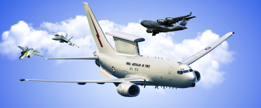
This is an example of a detailed illustration of RAAF Aircraft. This vector artwork was created using Adobe Illustrator. It contains imagery of the C17 Heavy Airlift in the background, an FA18 Super Hornet with an F35 Joint Strike Fighter, and finally, in the foreground, a Boeing 737 AEW&C E7A Wedgetail advanced airspace battle management. All the aircraft were created using the Gradient tool with final details added using the pen tool. All line work was expanded to complete the final piece.
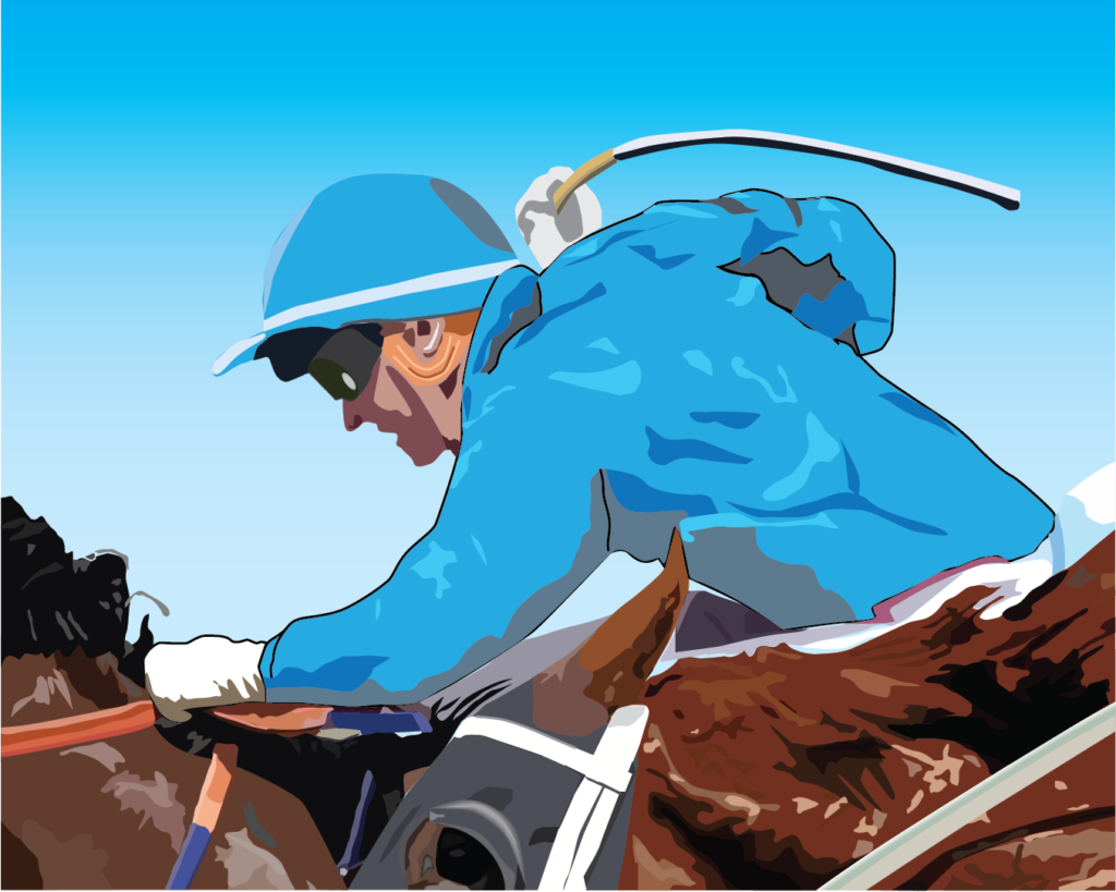
For a Melbourne Cup function at my workplace, I was tasked with creating a poster measuring A1 in size. Vectors were the ideal choice for this project, allowing for crisp and scalable graphics that maintain quality regardless of size adjustments.
Desktop Publishing
The document below showcases a blend of skills from Illustrator, Photoshop, and InDesign. Vector graphics were predominantly used for the front page and the sponsor space graphic of the go-kart, ensuring sharp and scalable visuals. Photographs taken during races underwent editing in Lightroom and Photoshop for final touches. The overall design was then assembled in InDesign, allowing for seamless integration of various elements. The color scheme of the document reflects a significant change within the racing team itself. Following my son’s diagnosis of Hodgkin Lymphoma cancer, he expressed a desire to adopt the colors of the Hodgkin Lymphoma Association—lime green and white. This strategic color shift not only symbolized support but also helped Longland Family Racing attract new sponsors and announce the new kart colors effectively.